(001)
Why This Product Mattered
Problem
The product was originally designed as a strip-first companion app, but was rapidly evolving into a multi-signal metabolic health platform. The existing UX wasn’t built to support multiple data sources, AI-driven insights, or diverse user types — creating a risk of fragmentation as the product scaled.
Julian (CTO)
Longtime Type 1 diabetic
Ali (CEO)
Father had Type 1
Center Health wasn't just another healthtech app. It was built by people who live the reality of diabetes. I joined at the perfect moment — the product was evolving from a strip-centric starter app into a full AI-powered metabolic health ecosystem. My role: design the systems, surfaces, and experiences that would make that evolution possible. So instead of "Let's build a cool feature," decisions often sounded like: "Would this have helped me last night?"
(002)
What I Have Designed
Feature Research & Credibility Evaluation.
Aria AI UX Flow & Interaction design, making it the BRAIN & Soul of the app.
User research & Flow Architecture.
Doctor & Patient portal.
Website Redesign.
Connected Devices interaction design.
UX for Mobile app Redesign.
Rapid iteration pipelines (Hotjar, CS insights, micro-fixes)
Design system , cross-platform, tokenised with documentation.
Brand Design, Marketing assets, Pitch decks & Printing Materials.
(003)
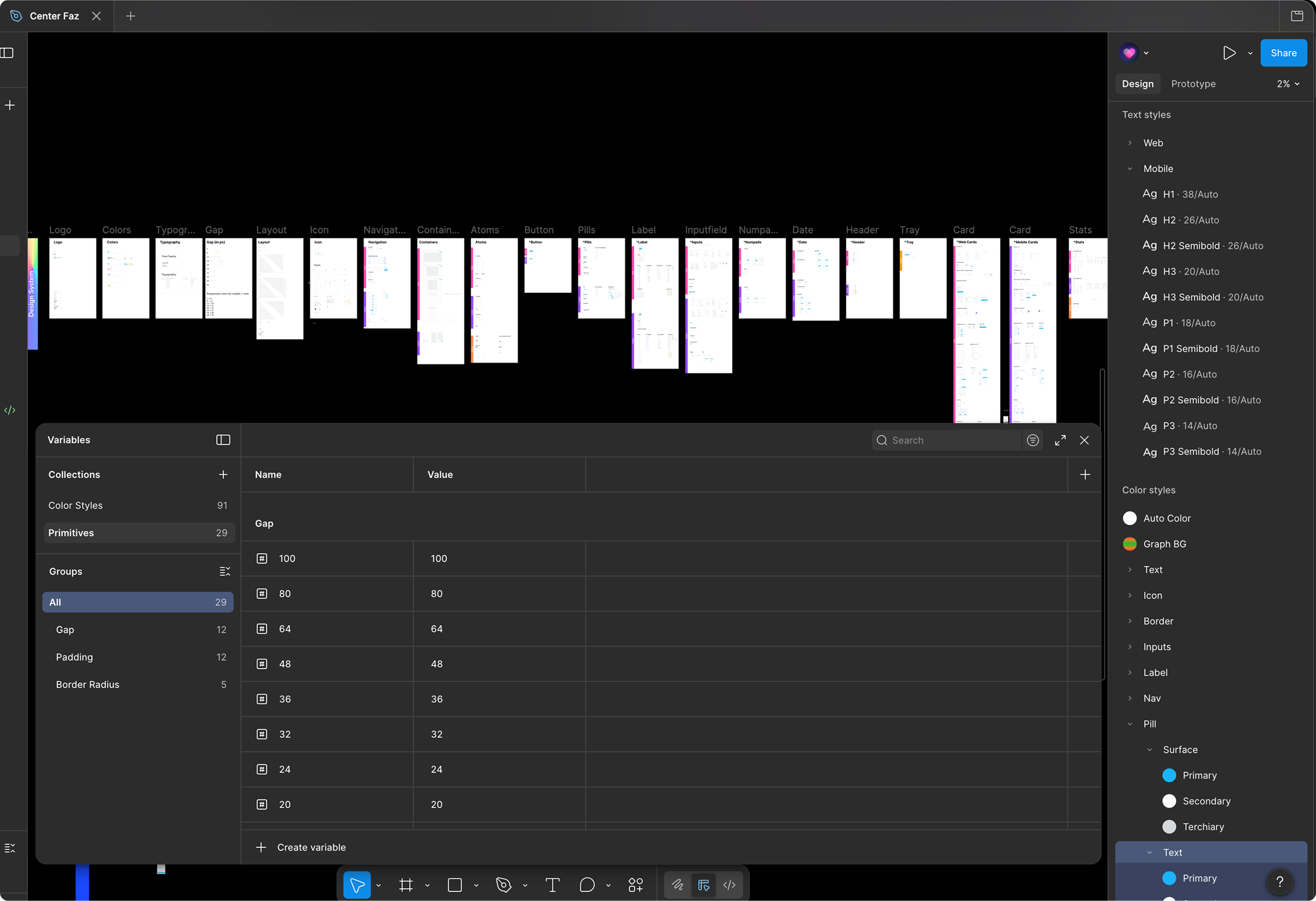
Design System: The Invisible Infrastructure
Three platforms. Multiple feature teams. We needed coherence.
Problem
Multiple teams were shipping across platforms without a unified system. This led to inconsistent UI patterns, duplicated components, and slower development cycles — making it difficult to scale the product without increasing design and engineering overhead.
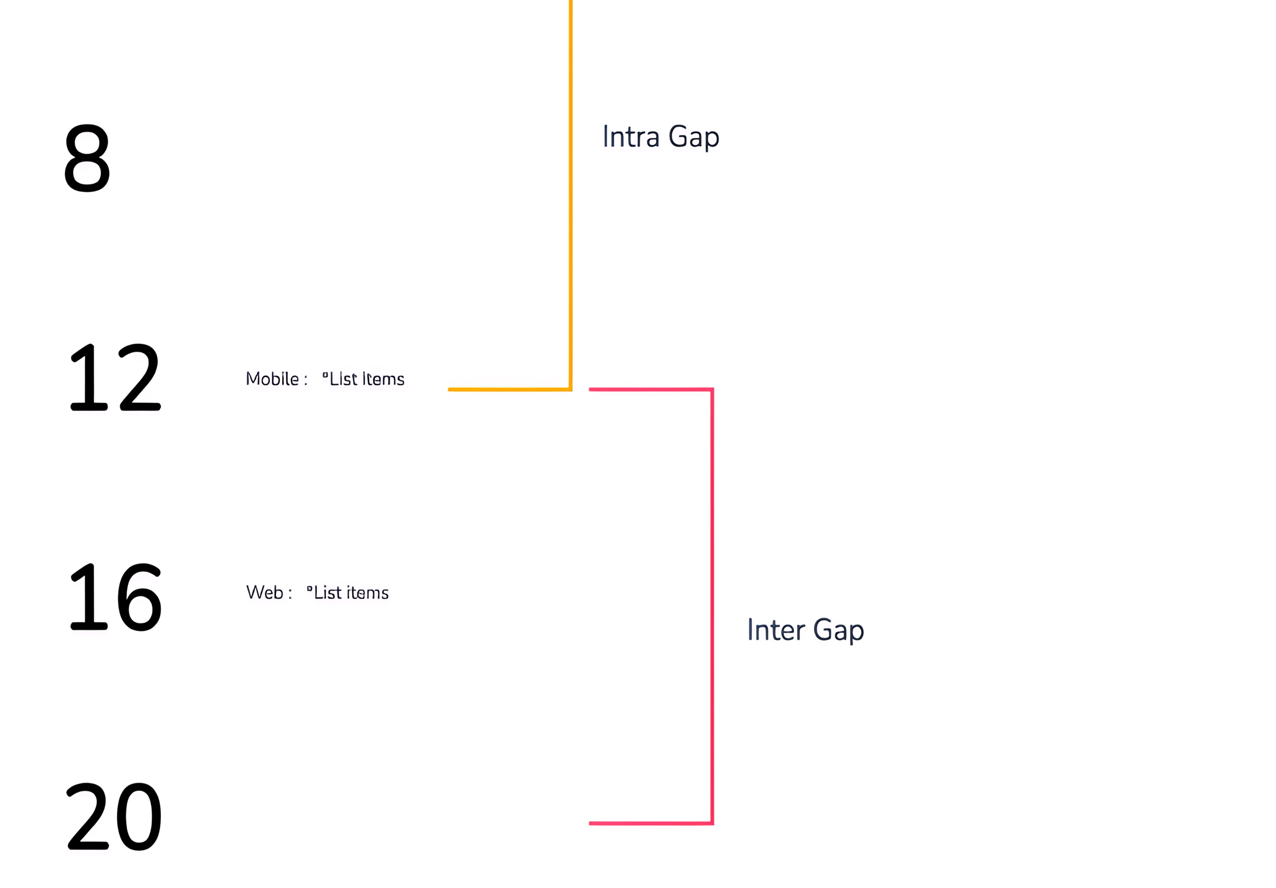
Tokenized foundation: color, spacing, typography, Shadow.
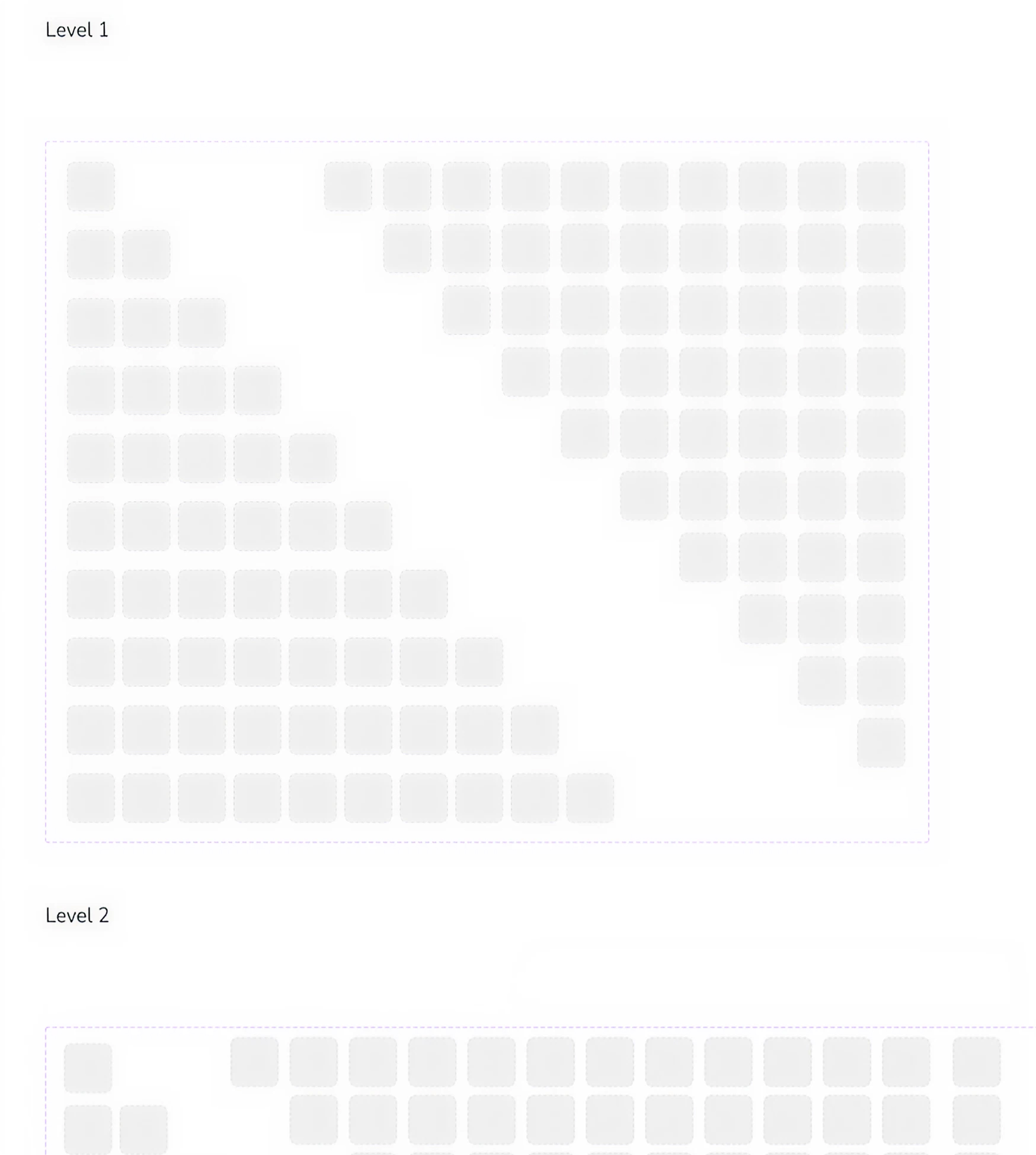
Everything is an instance of a master atomic component.
Level based nested Block Structure contain predefining padding, Gap & Typography behaviour.
Custom Icon, Image & Illustration Library with color-coded health domains.
Interaction, Tone and Component Use case, Adaptive logic all Documented.
Dev-first structure (gap scales, boilerplate rules)
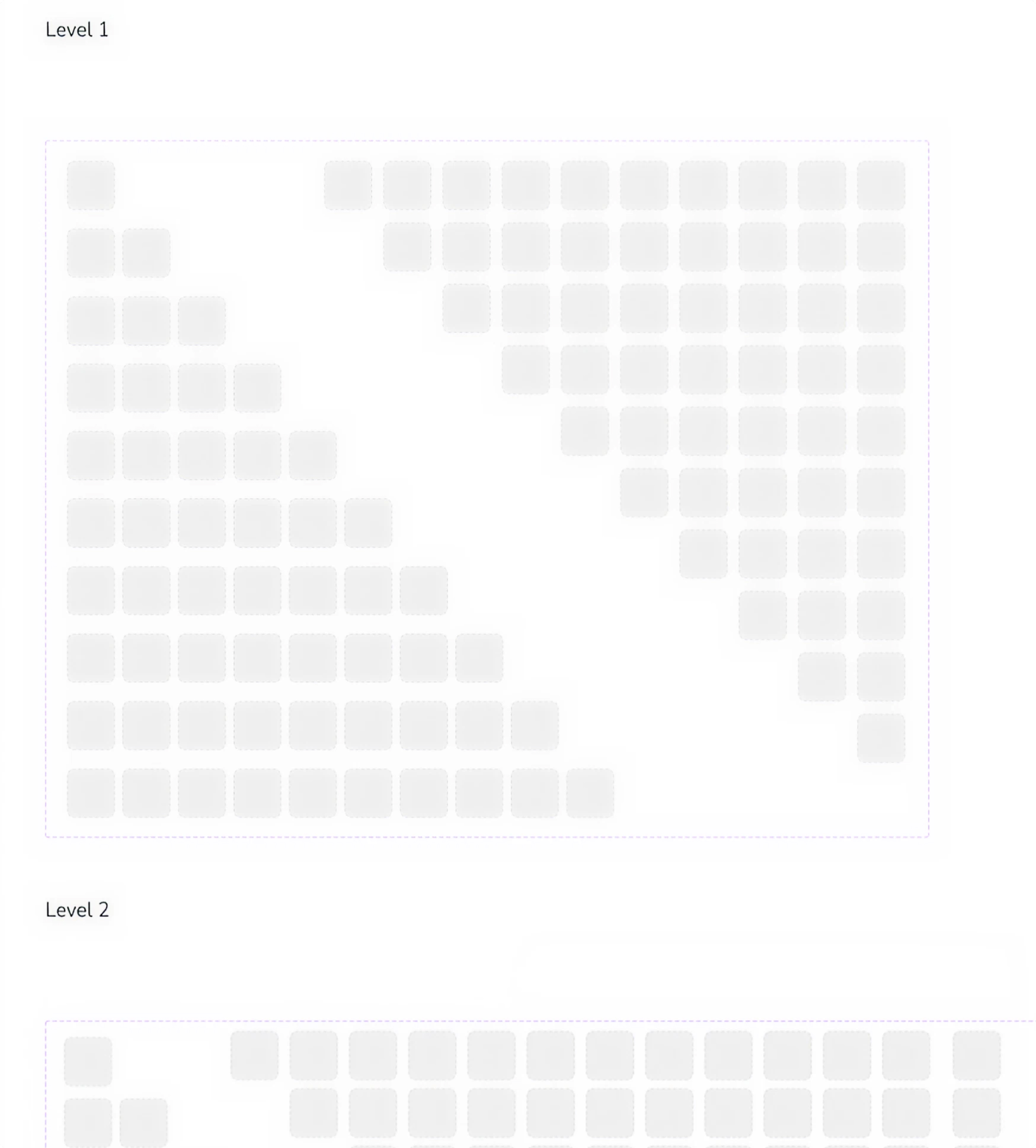
Results
40% Faster ship cycles. Cleaner UIs. Lower cognitive load for users. And fewer surprises for developers.
(004)
Onboarding: Adaptive UX Based on Pre-Personalised Experience
Problem
A single linear onboarding flow was being used for fundamentally different user types — from Type 1 diabetics to caregivers. This resulted in irrelevant inputs, lower completion rates, and weak initial data quality for Aria’s personalization.
Center Health expanded from one user type to five: Type 1, Type 2, prediabetes, weight-loss users, caregivers, and clinicians. One single onboarding funnel wasn't going to cut it.
What I designed
Persona-based branching on step one
Modular steps library: Diagnosis info, A1c range, meds, comorbidities
Goals + behavior patterns
Device setup (Duo, CGM, Dexcom, Apple/Google Health)
Progressive disclosure and resume-anytime logic
Designed prompts that feel like a friendly conversation, not a tax form
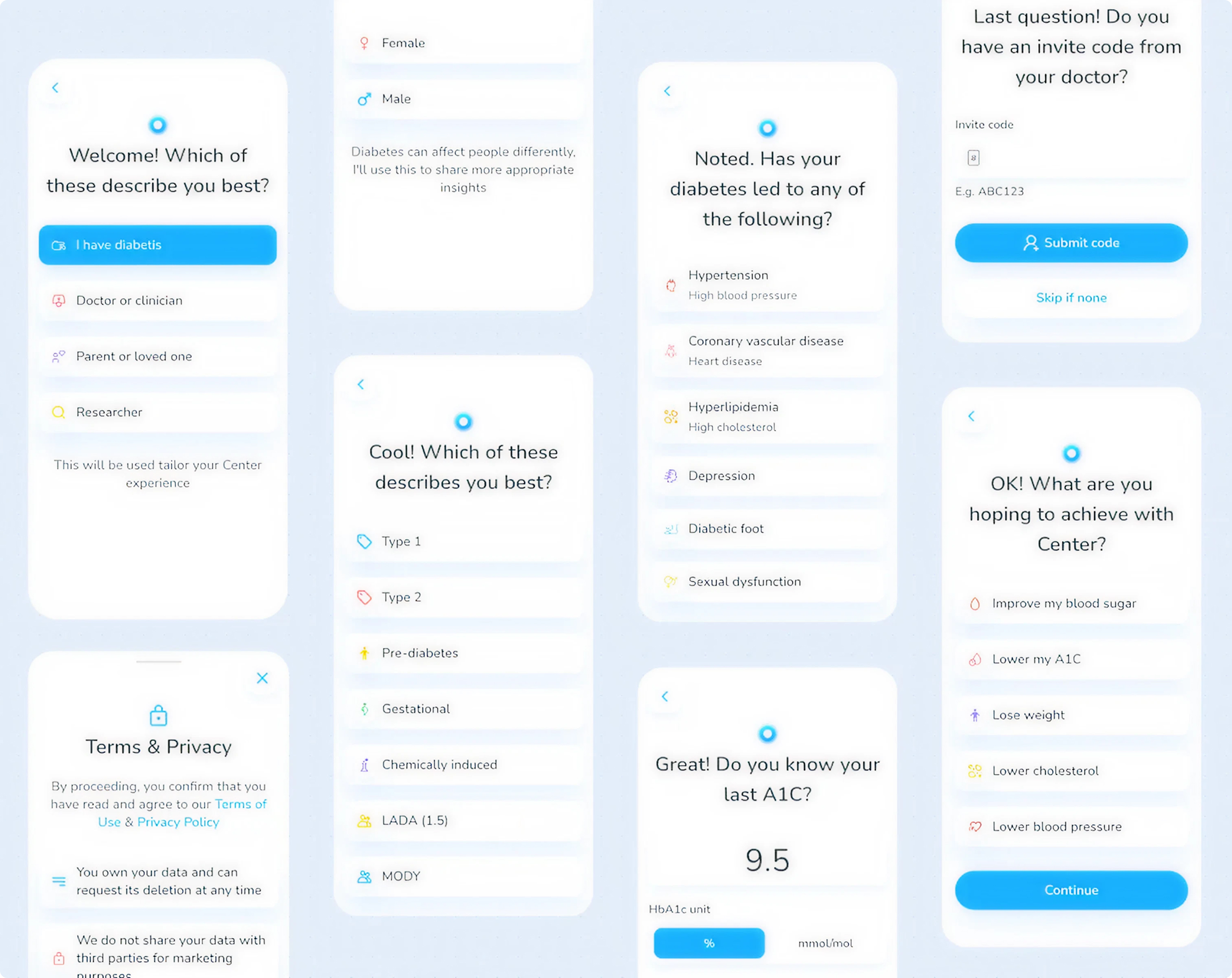
Results
Users entered the app already feeling understood. Setup completion rates improved — and Aria had better data from day one.
(005)
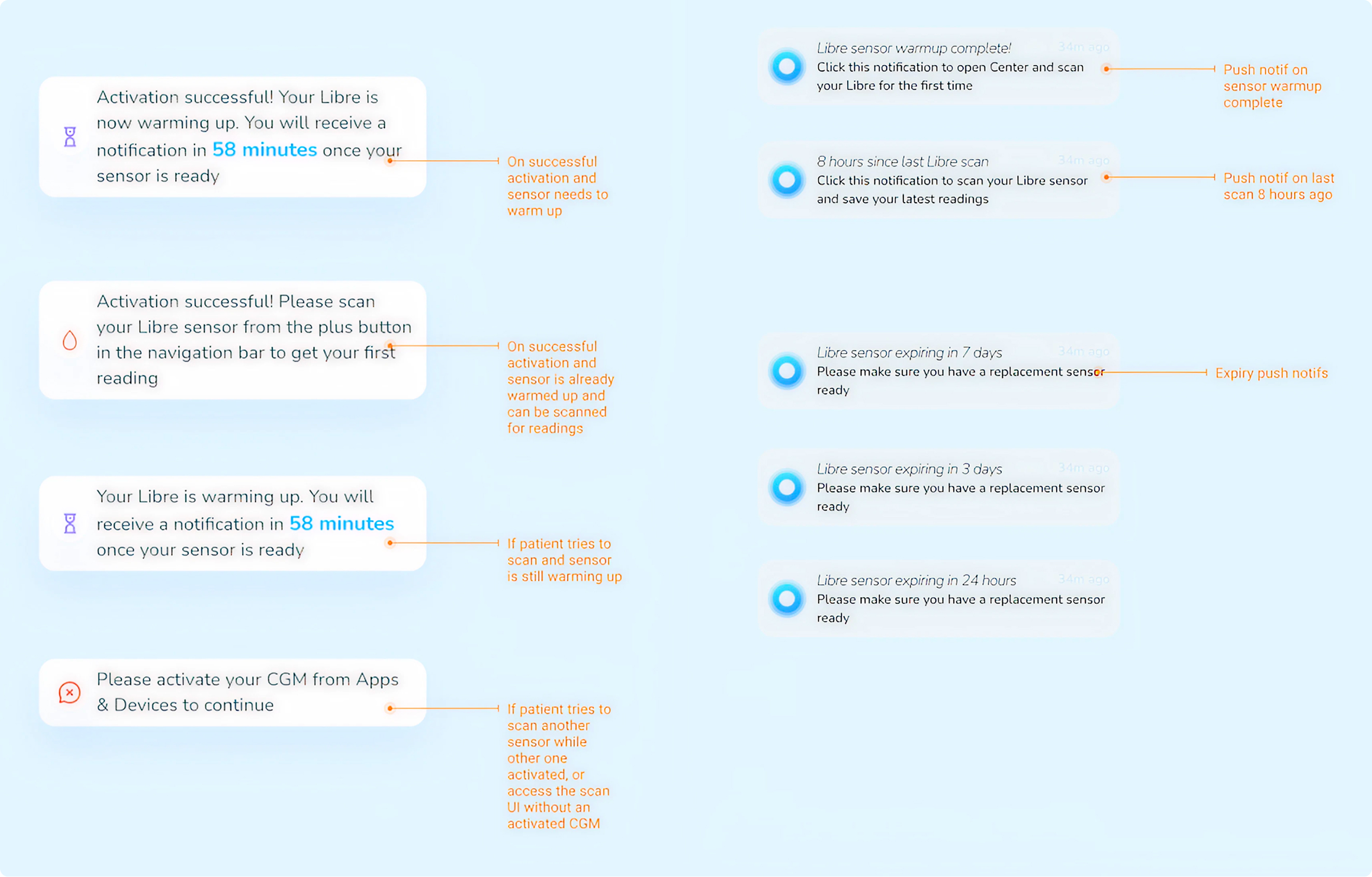
Devices Integration, Interaction & Results
The platform supported a growing range of connected health devices. Each had its own pairing logic, data format, and edge cases — and each needed to feel seamless.
Problem
Each connected device came with its own pairing logic, edge cases, and data structures. The experience was inconsistent and often fragile, leading users to rely on manual logging instead of real-time integrations.
What I designed
Blood Glucose Meter Flow
Blood Pressure Calf Flow
Weight Scale With Pulse Detection Flow
CGM Integration Flow
Fitness Data Source Integration Modules
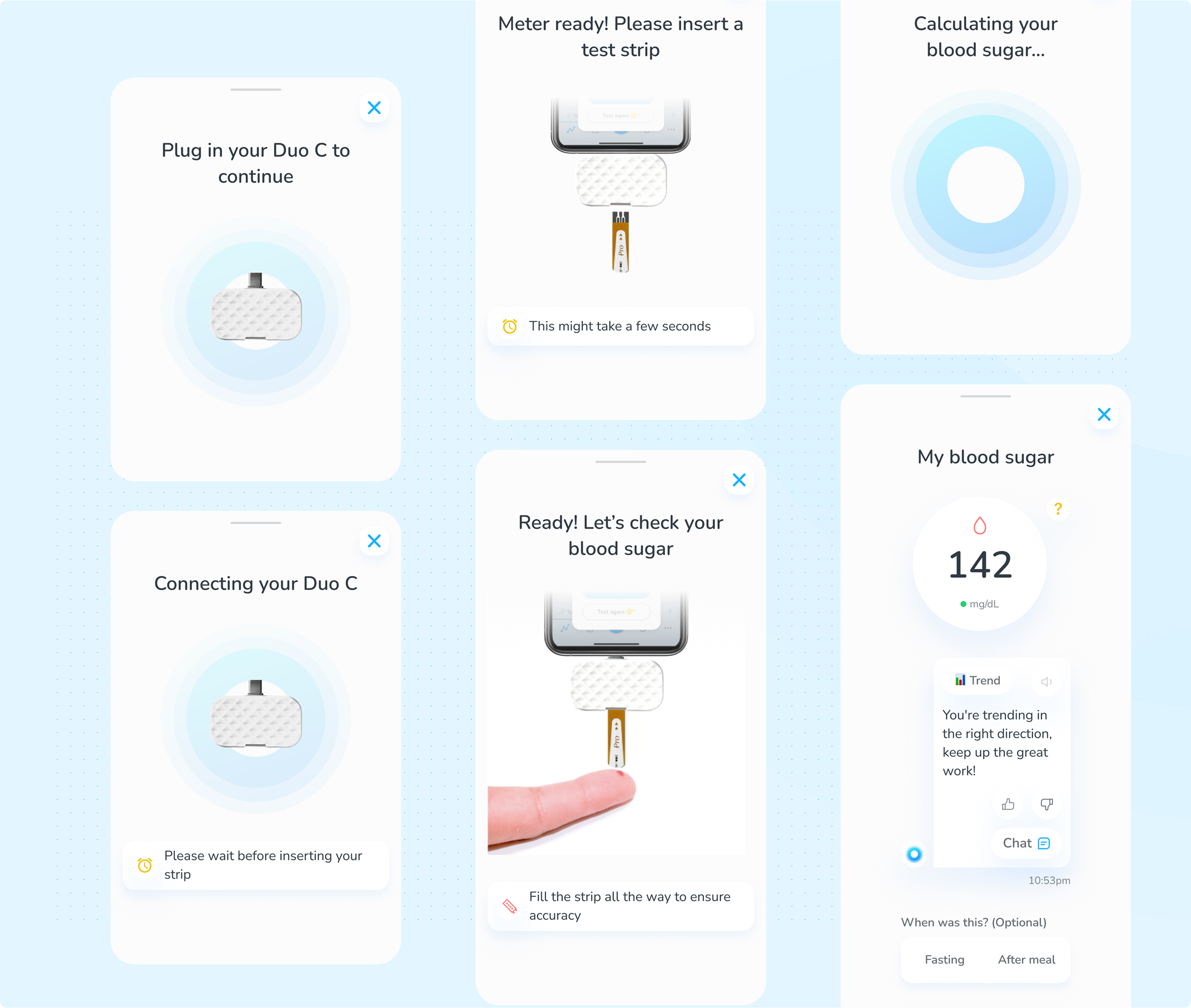
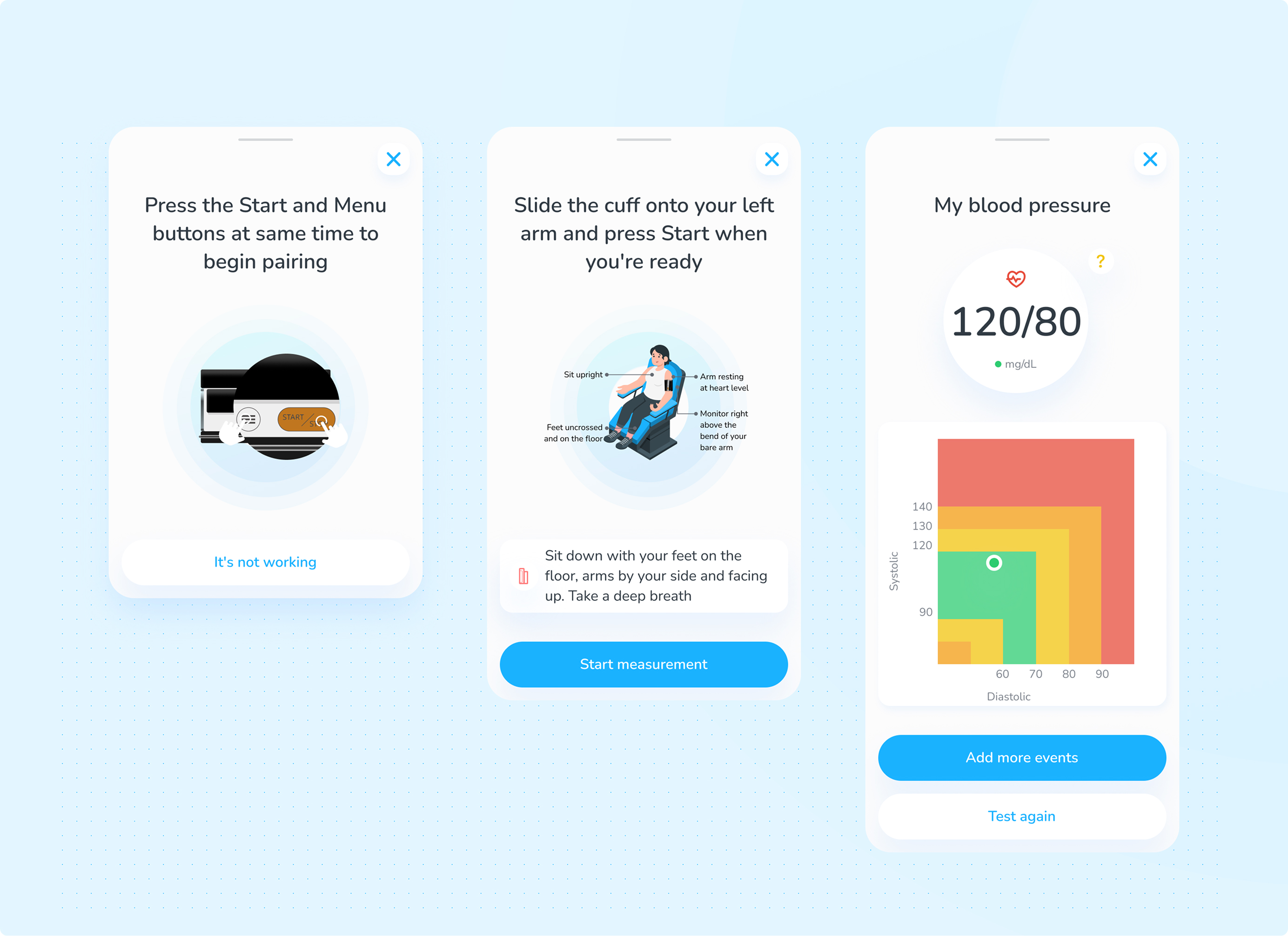
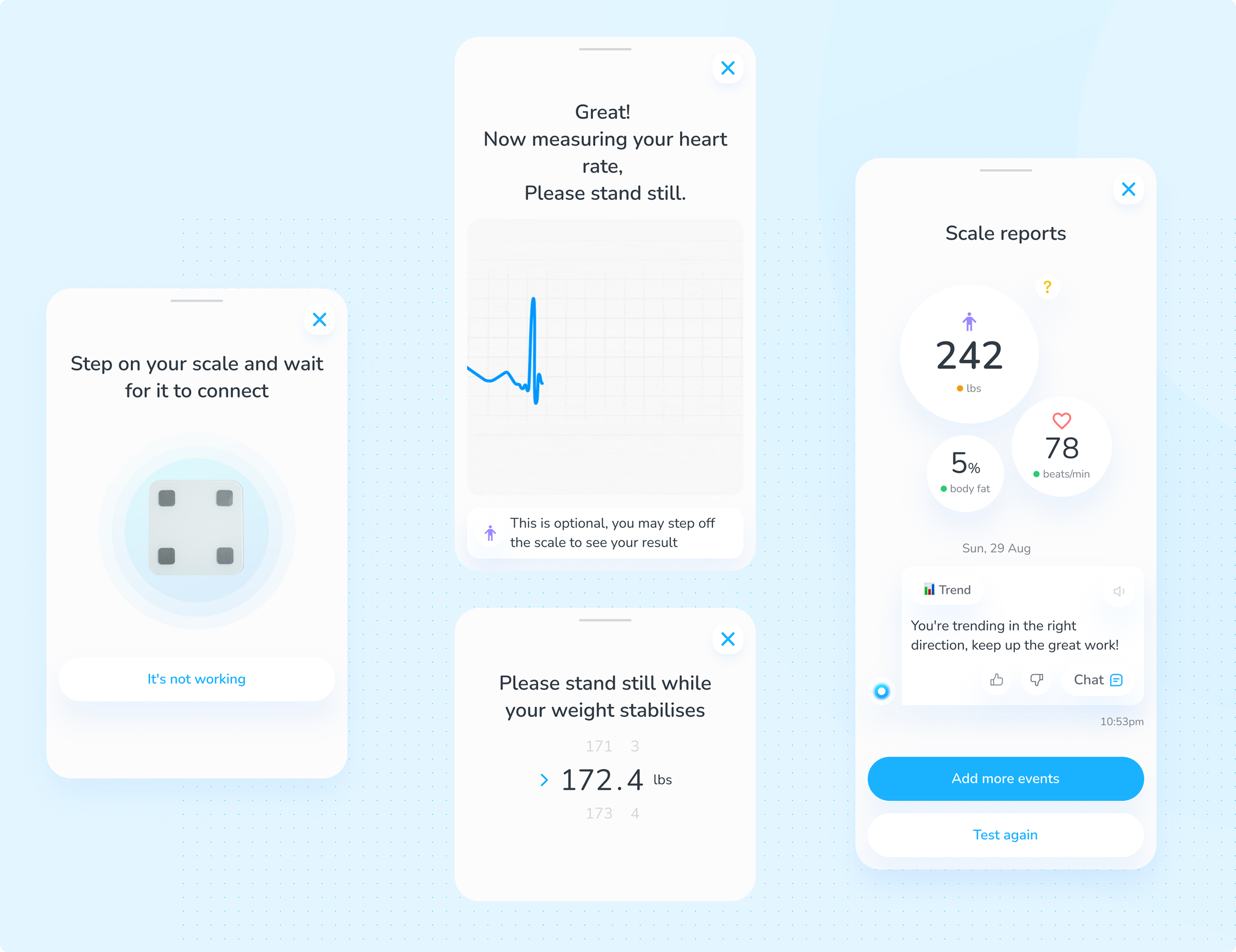
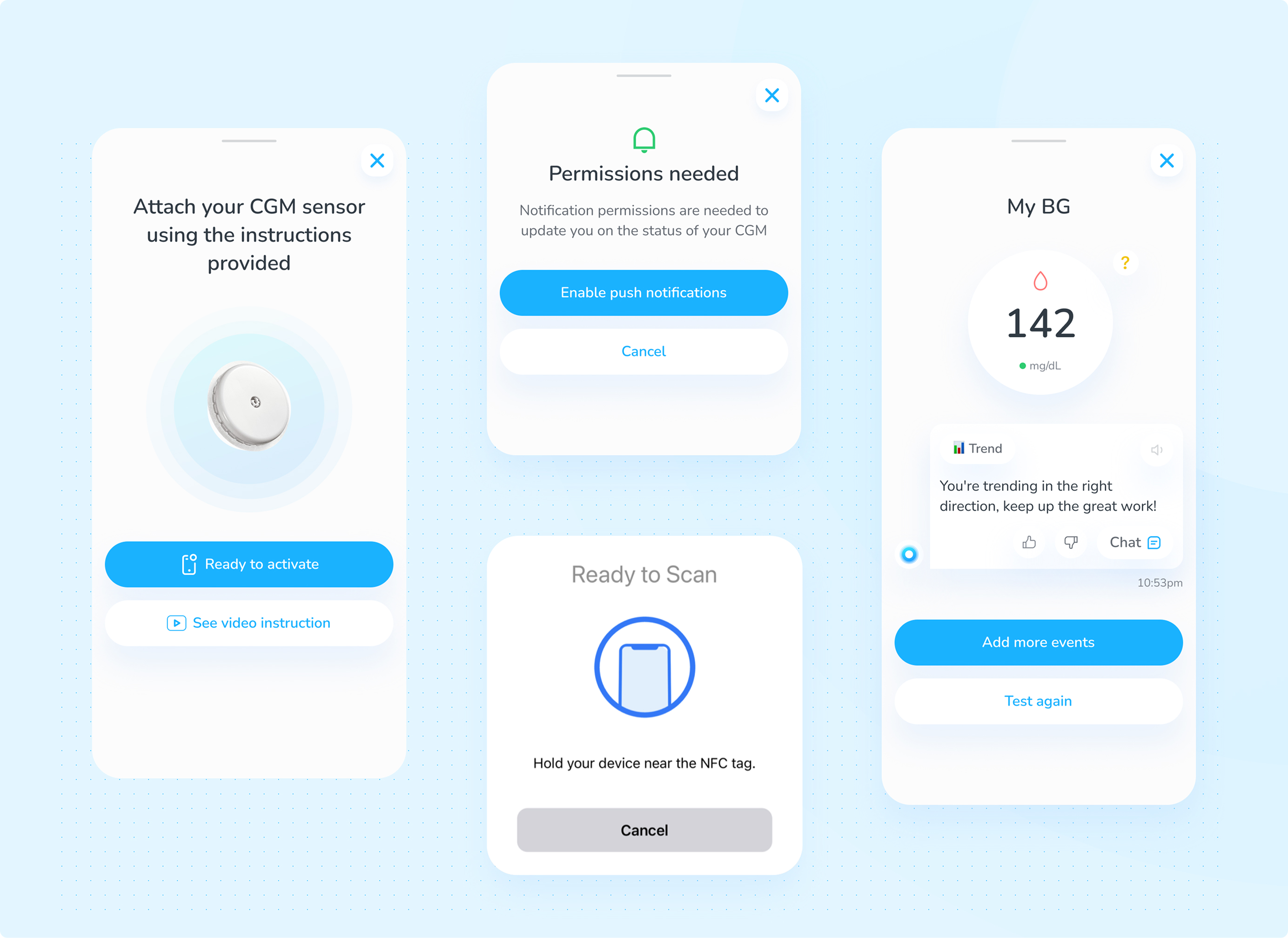
Results
Each device integration reduced manual logging friction and fed Aria richer real-time data.
(006)
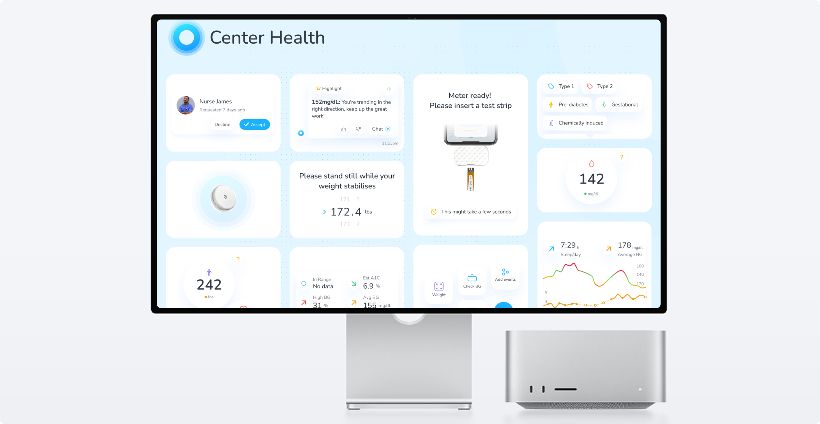
Home: Turning Readings into Real Understanding
Problem
The dashboard displayed health metrics in isolation, without helping users understand relationships between them. As more data sources were added, the interface risked becoming more complex without becoming more useful.
The v1 dashboard was perfect for early strip users.…but the product had grown into something much bigger: CGM data, nutrition, meds, sleep, activity, mood, weight, caregiver access. We needed a dashboard that behaved like a health intelligence layer, not just a chart.
What I designed
"glanceable" safety strip: current BG + time-in-range
3×2 dynamic health tiles: auto-ranked by what the user logs most
Multi-factor comparison graphs: BG vs meals, sleep, insulin, exercise, calories
Aria insight lane built into the dashboard's fold
Shareable summaries for doctors & caregivers
Dev-first structure (gap scales, boilerplate rules)
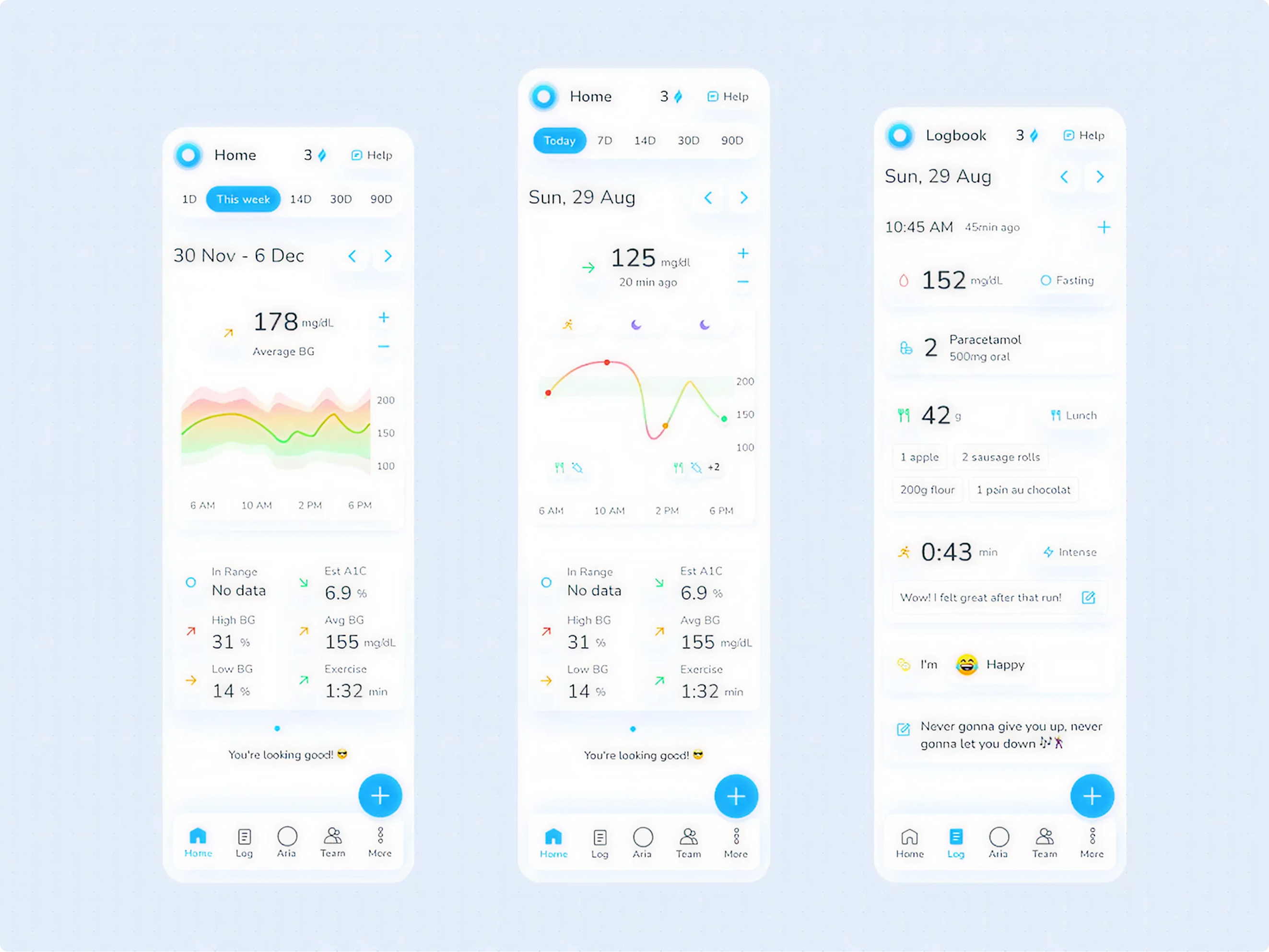
Results
Users could finally see patterns, causes, and trends — not isolated numbers. The dashboard became the daily command center of their metabolic health.
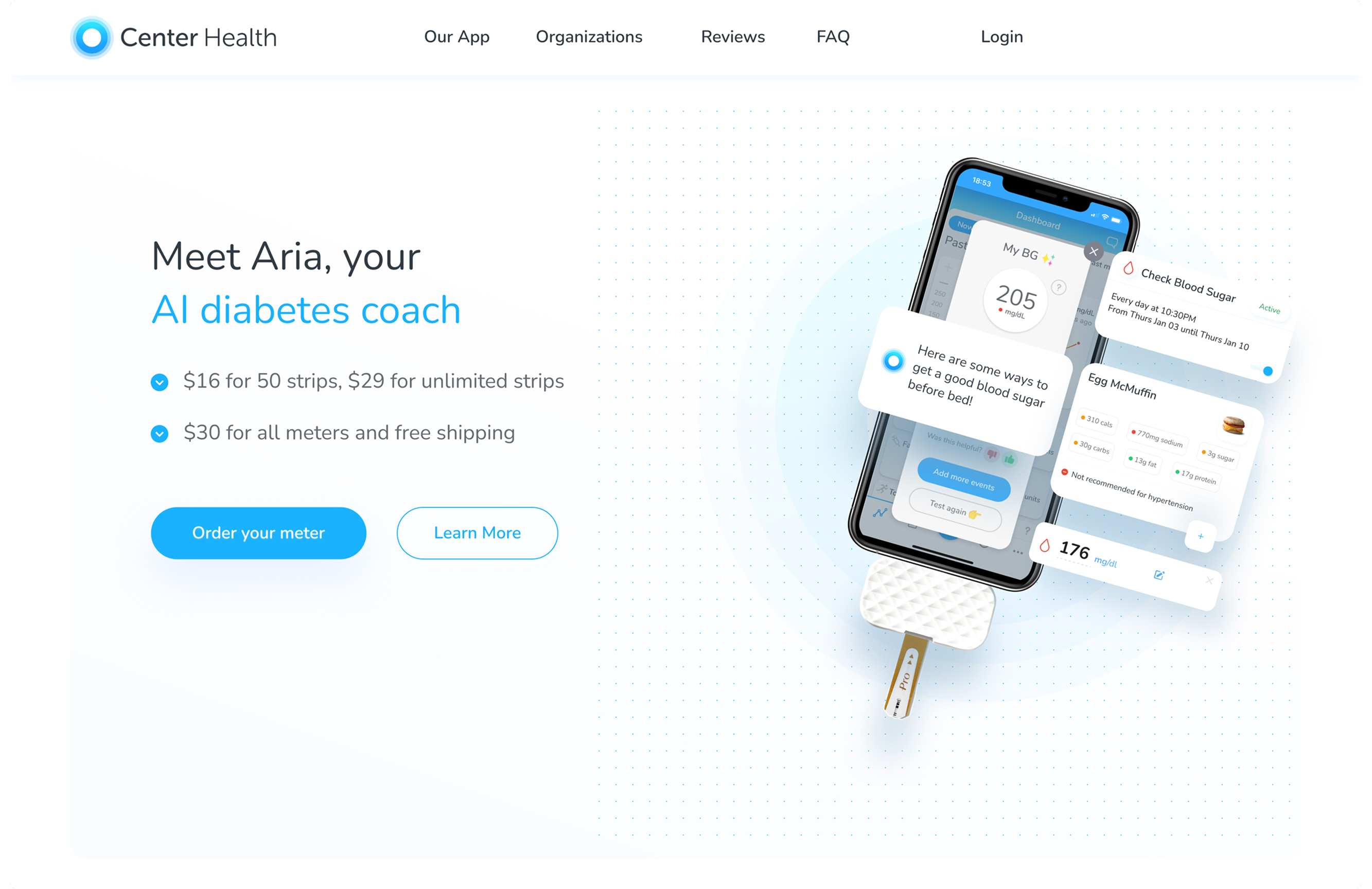
(007)
ARIA: Giving the Platform a Brain & Soul
Problem
Aria existed as a backend intelligence layer but lacked a clear presence in the user experience. Insights were passive and disconnected, making the AI feel invisible rather than central to the product.
Aria become the mind and soul with insights, trends and suggestions. Aria already powered insights in the backend. But to users, it felt like an invisible ghost. We needed to give Aria a face, voice, personality, and safe boundaries.
ARIA Chat & Feed
Personalised to the core & Individual User aligned.
Active monitoring, Comparison showcasing.
Insights, trend showcase.
Health Coaching based on the health data points.
Voice Tones & Personality preferences.
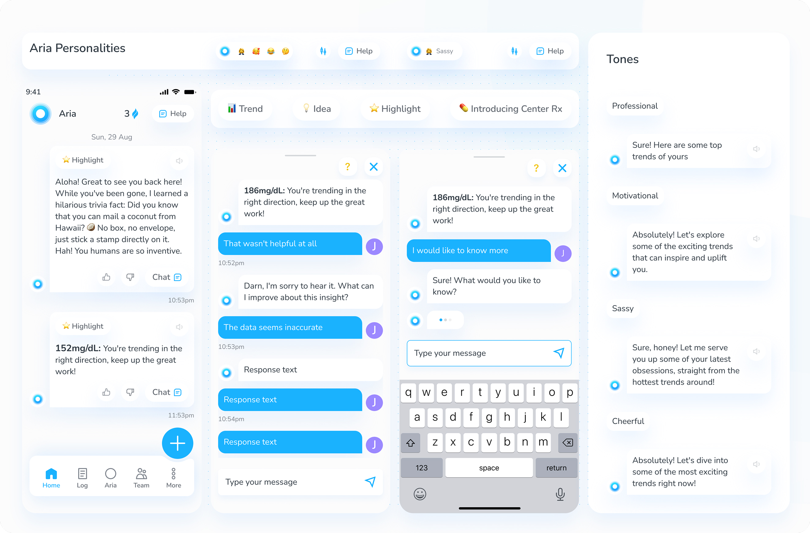
ARIA Notification System
Results
Aria became the emotional core of the product — the part users talked to, not just looked at. It also aligned the company's branding, website, and product story around AI-first health coaching.
(008)
Logging, Reminders & Habit Systems
Better logging = smarter Aria. But logging is… logging. People forget.
Problem
Logging required effort and consistency, but the system did little to reduce friction or reinforce habits. As a result, data quality suffered — directly impacting the effectiveness of AI-driven insights.
One-tap logging hub
Context-aware defaults (fasting, post-meal, etc.)
Logging type ascending based on frequency.
Daily tasks & streaks to gently drive consistency
Passive integrations (Apple Health, Google Fit)
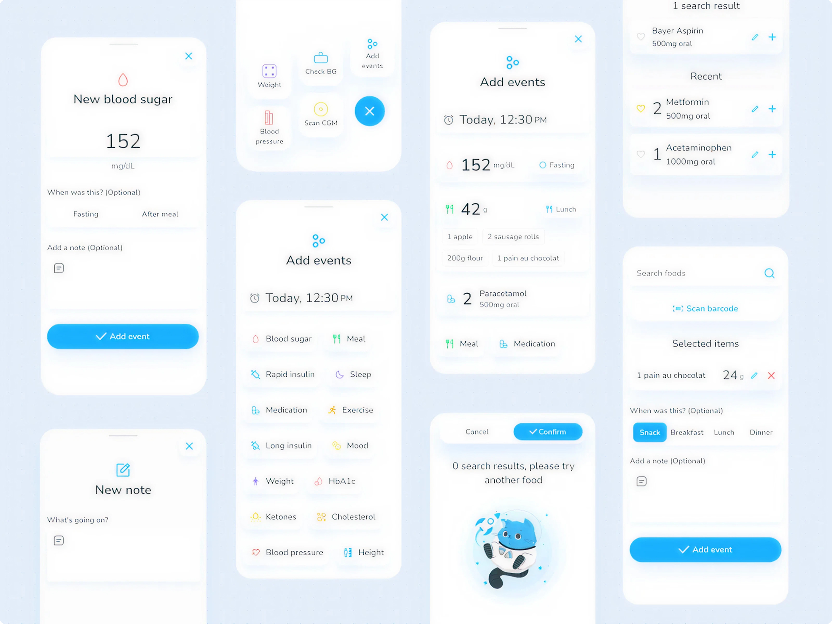
Results
Logging frequency increased significantly. Aria became sharper, more relevant, and more "on your side."
(009)
Meal Logging, Nutrition & Restaurant Menu Suggestions
If BG is the "what," then food is the "why." The product needed a diabetic-friendly approach to meals.
Problem
Blood glucose readings showed outcomes, but users lacked clear visibility into the causes behind them. Food tracking was either too generic or too complex, limiting its usefulness in understanding metabolic patterns.
Curated searchable food database
Build-your-own meal with ingredient-level accuracy
Save custom meals for two-tap logging
Aria feedback on carbs → actions ("A short walk can help level this out.")
Restaurants menu integration and recommendations
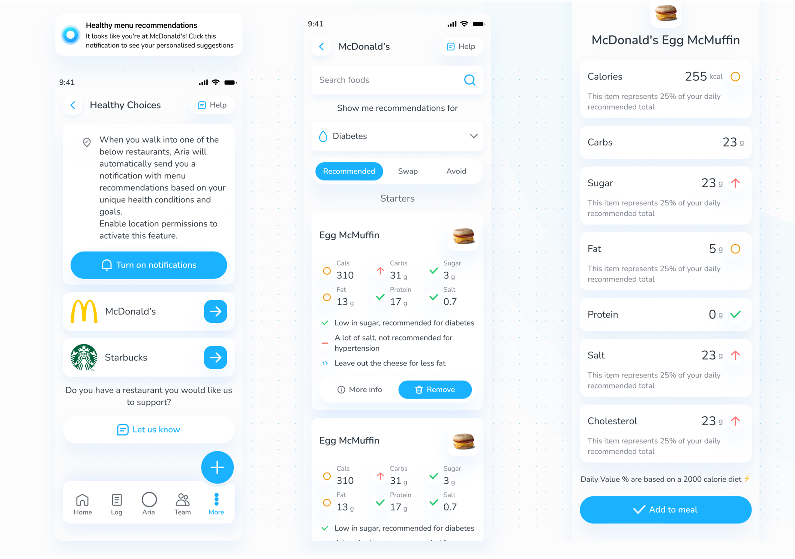
Results
Food became as measurable as blood sugar — giving Aria the context it needed to coach more precisely.
(010)
Website: Rewriting the Story for an AI-First Future
Problem
The product had evolved into an AI-first health platform, but the website still communicated a hardware-centric narrative. This created a disconnect between user expectations and the actual product experience.
Aria-driven hero narrative, as the product shifted its pitch from strips to ARIA.
Clear explanation of how AI turns data into coaching
Program pages for diabetes, prediabetes, weight loss, metabolic health
Visual identity aligned with the app
Results
The website finally told the story the product was already living.
(011)
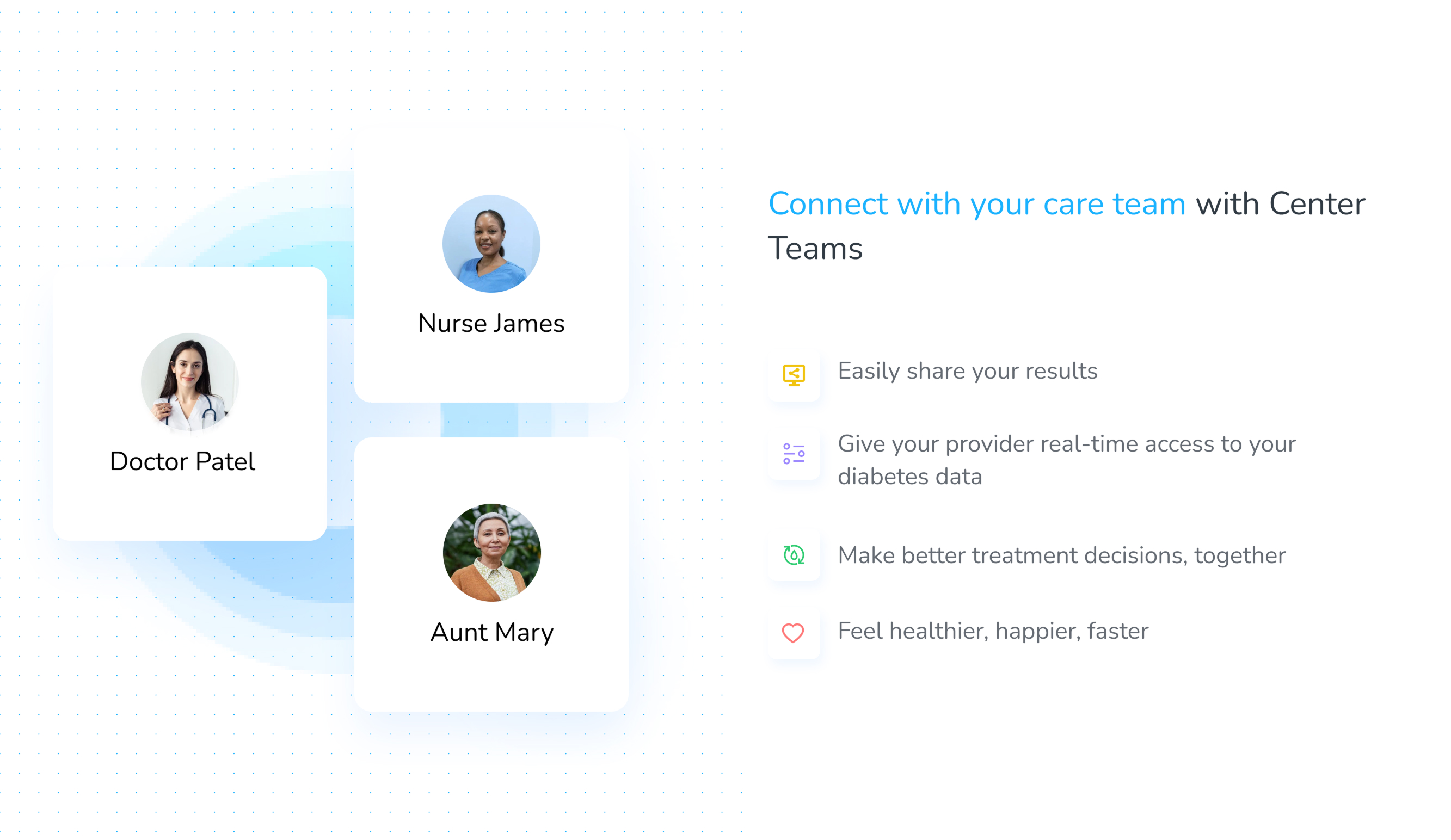
Provider Portal: Giving Clinicians Superpowers
Problem
Clinicians relied on fragmented data and patient-shared screenshots, making it difficult to assess health trends or provide informed guidance. There was no structured interface for clinical decision-making.
Doctors were working off screenshots sent by patients. Not scalable. Not safe. Not helpful.
A triage-friendly patient list with at-a-glance risk indicators
Detailed BG timelines with data overlays (meals, meds, sleep, activity)
View of recent Aria insights, so clinicians knew what coaching patients already received
Clear, reversible permission model for data access
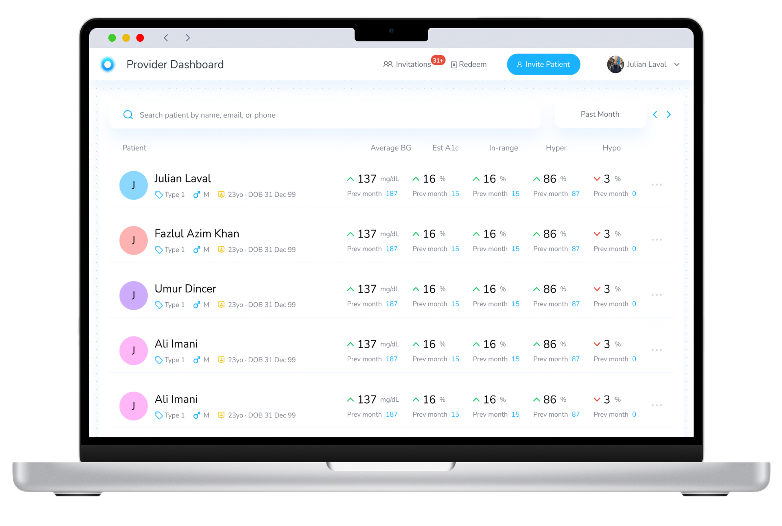
Results
Clinicians finally had a meaningful tool to evaluate patients' metabolic health remotely. This unlocked new strategic B2B conversations for Center Health.
(012)
Branding, Packaging Designs
(013)
The Continuous UX Engine
Problem
User feedback existed across multiple channels, but there was no structured system to continuously capture, analyze, and act on it. This slowed down iteration and made improvements reactive instead of systematic.
Hotjar session reviews
Research User feedback from app+play store, customer Support, Analyze & loop
Notification + copy experiments
cleaned friction points, tightened flows
(014)
Reflections of Two & Half Years. The Scale-Up Stage.
System Challenge
The core challenge wasn’t designing individual features, but building a system where data collection, AI insights, and user behavior continuously reinforce each other — turning the product into a true health intelligence loop.
01
Domain depth improves design decisions.
02
Adaptive AI UX
03
Design systems Cross-platform consistency
04
Data visualization
05
Healthcare Design complexity
06
Business + product intuition
Recommendation Letter
CTO: Julian Laval